Illustration System
📀 Product Design
Riskified
My role was to research the project’s needs and potential, define and oversee the new design language, and take a hands-on role in developing components and rules for the new system.
As Riskified evolved and the Control Center gained more capabilities, we decided to add an imagery layer to create a positive and empowering user experience.
The Issues & Opportunities
External Users
🍯 Stickiness
Add personality and a delightful experience to our system, making users feel more connected and appreciated, while maintaining a professional tone with moments of humor and creativity.
🛼 Cohesive Design at Speed
Design a system for our product/design team that is fast and easy to use while maintaining a cohesive, recognizable style.
Internal Users
🧭 User Experience and Enablement
The goal was to guide users seamlessly through updates and workflows while reducing cognitive load around complex content. At the same time, the system was designed to recognize achievements, milestones, and progress, creating a more engaging and supportive user experience.
Research
I mapped all the different use cases in the Control Center that would benefit from illustrations, and analyzed their usability differences. Additionally, I developed a visual language that works across various sizes and intensities.


Solution
Part 1
Defined three sizes of illustrations using “T-shirt” sizes
Developed two styles: minimalistic & monochromatic (to avoid overshadowing the UI), and bold & colorful, with animations for specific cases

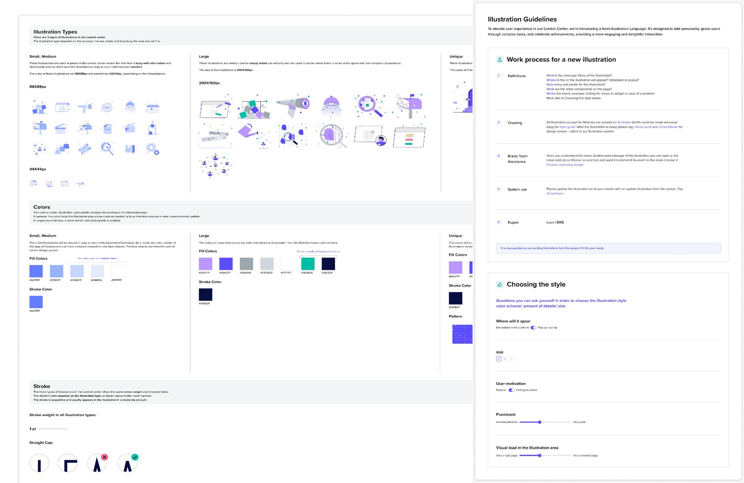

Part 2
Created components to effectively hold the illustrations, ensuring alignment with the design system.

Examples
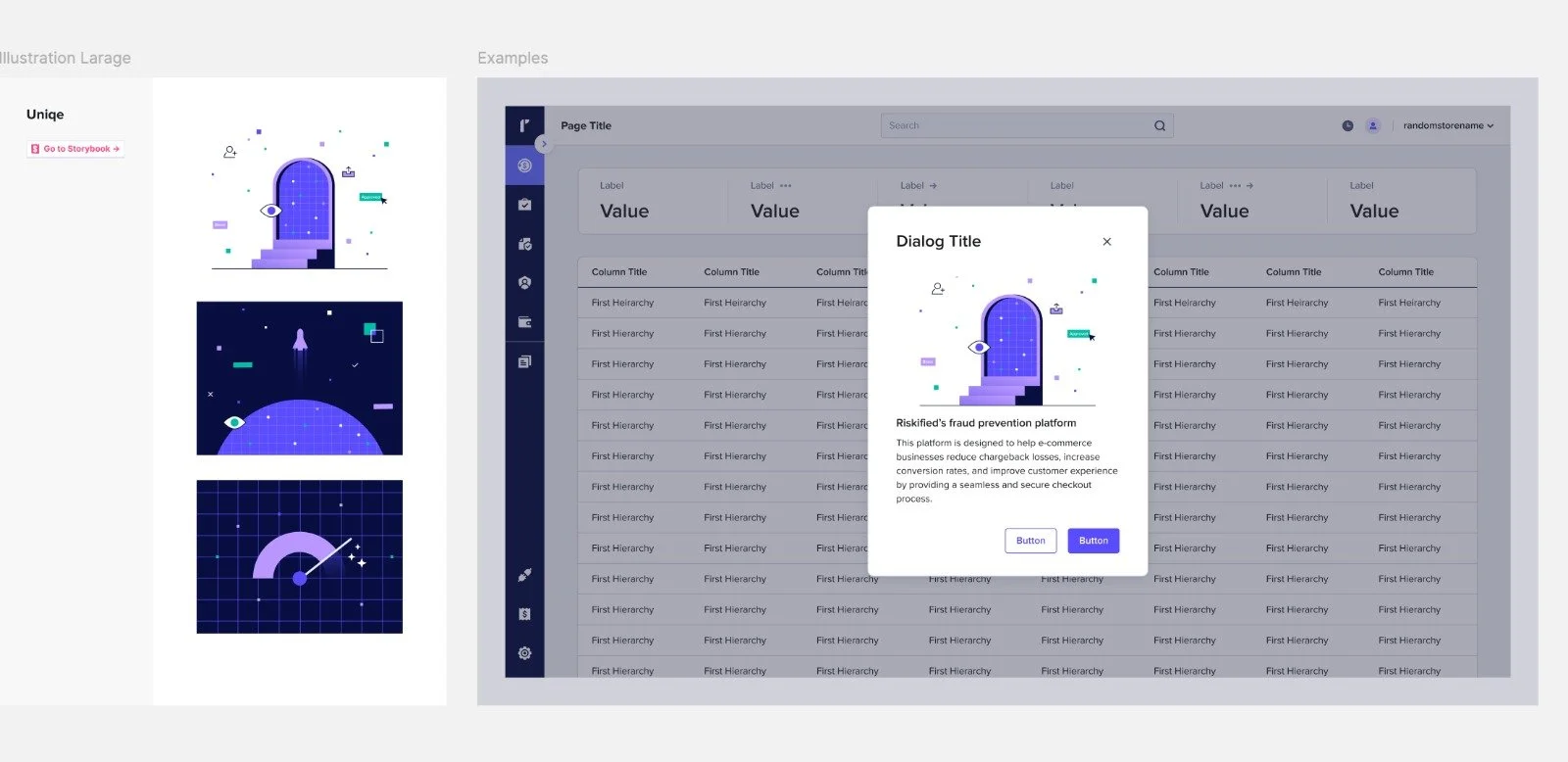
Part 3
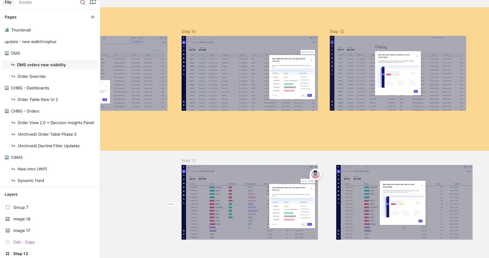
Walkthroughs
Most new features in the Control Center are introduced to users through walkthroughs. My aim was to create variables that could be easily implemented with the new UI. By defining fixed styles and sizes, designers can quickly and easily create walkthroughs.
Example